CSS vh and vw, and %. So What's The Difference?
Hi there,
This article will be short one :)
Yesterday when I was fixing layout I asked what’s the difference between units vh/vw and % Let’s see an example
<style>
.vw-style {
width: 50vw;
background-color: green;
}

      .percent-style {
        width: 50%;
        background-color: red;
      }

    </style>


    <div class="percent-style">50%</div>
    <div class="vw-style">50vw</div>
Looks like both is going to take 50 percent of width of the viewport. And that’s right. in this case it will give you exactly the same result.

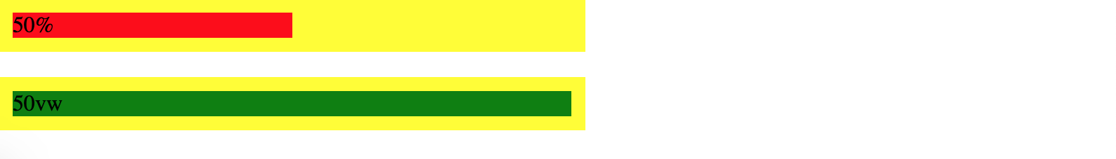
Now let’s see slightly different case. We will put our divs into parent div which has width set to 50%:
<style>
.vw-style {
width: 50vw;
background-color: green;
}

      .percent-style {
        width: 50%;
        background-color: red;
      }

      .parent {
        padding: 10px;
        width: 50%;
        background-color: yellow;
      }
    </style>

    <div class="parent">
        <div class="percent-style">50%</div>
    </div>

    <div class="parent">
        <div class="vw-style">50vw</div>
    </div>
In this case child div with width 50% will take 50% of parent’s width and child div with width 50vw will still keep 50% of viewport (the browser window size) and not parent div. Like this:
That’s all the difference. VW and VH - those are viewport-percentage units.
| Unit | Meaning |
|---|---|
| vw | 1/100th viewport width |
| vh | 1/100th viewport height |
| vmin | 1/100th of the smallest side |
| vmax | 1/100th of the largest side |
Hopefully it will help!